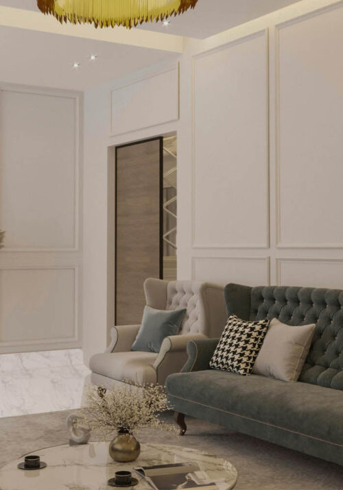
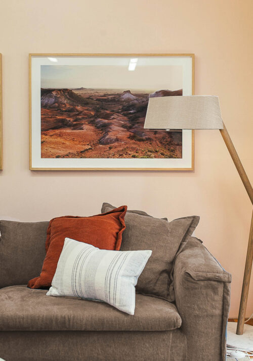
Color is a powerful tool in interior design, capable of transforming spaces, evoking emotions, and influencing moods. Understanding color theory and psychology is essential for creating harmonious and impactful interiors.
In this guide, we’ll delve into the intricacies of color, exploring how to effectively utilize it to enhance your design projects.
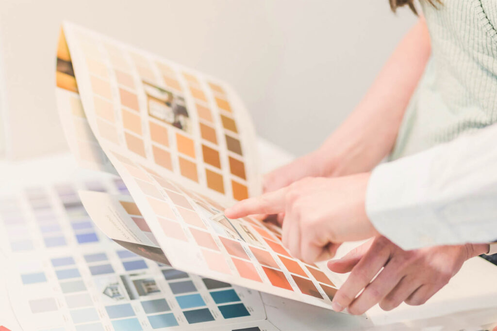
Understanding Color Theory
Color theory forms the foundation of effective color usage in design. It encompasses principles such as the color wheel, color harmony, and color relationships. The color wheel, consisting of primary, secondary, and tertiary colors, serves as a visual representation of how colors relate to one another. By understanding the relationships between these colors, designers can create cohesive palettes that resonate with their intended aesthetic.
Creating Color Harmony
Achieving color harmony is key to creating visually appealing interiors. There are several methods for achieving harmony, including complementary, analogous, and triadic color schemes. Complementary colors, positioned opposite each other on the color wheel, create dynamic contrast when paired together. Analogous colors, found adjacent to each other on the wheel, offer a more subtle and cohesive palette. Triadic color schemes utilize three evenly spaced colors on the wheel, striking a balance between contrast and harmony.
In addition to these classic color schemes, designers can explore more nuanced combinations to achieve harmony in their designs. Monochromatic schemes, for instance, utilize varying shades and tints of a single color, creating a sense of cohesion and simplicity.
Split-complementary schemes involve selecting a base color and then using the two colors adjacent to its complementary color on the wheel, offering a balance between contrast and harmony with a softer visual impact. Tetradic schemes, also known as double complementary, involve selecting two pairs of complementary colors, providing ample opportunities for creating vibrant and balanced palettes. These advanced combinations allow designers to tailor the level of contrast and unity in their designs to suit the desired aesthetic and mood of the space.
Eliciting Emotions with Color Psychology
Color psychology explores the emotional and psychological effects of different colors on individuals. Warm colors such as reds, oranges, and yellows evoke feelings of energy, passion, and warmth, making them ideal for spaces intended to stimulate activity and conversation. In contrast, cool colors like blues, greens, and purples evoke feelings of calmness, tranquility, and serenity, making them well-suited for spaces designed for relaxation and contemplation.
Keep reading to unlock the secrets of color mastery with our comprehensive guide, delving into the realms of color theory and psychology to enhance your design skills and captivate your audience.
Utilizing Color in Different Spaces
The effective utilization of color in different spaces is paramount to creating environments that not only look visually appealing but also serve their intended purpose optimally. In living areas and social spaces, where gatherings and interactions are common, vibrant and energetic colors can play a crucial role in fostering a lively atmosphere. Bold hues such as vibrant reds, energetic oranges, or invigorating yellows can inject a sense of warmth and excitement into these spaces, encouraging socializing and entertainment.
Additionally, incorporating complementary accents or contrasting shades can add visual interest and create dynamic focal points, enhancing the overall ambiance.
Conversely, when it comes to bedrooms and relaxation spaces, the focus shifts towards creating a serene and tranquil atmosphere conducive to rest and rejuvenation. Soft, soothing hues such as gentle blues, calming greens, or serene lavenders can evoke feelings of calmness and relaxation, helping to alleviate stress and promote better sleep.
These subtle yet soothing colors can be complemented by warm neutrals or muted tones to create a cozy and inviting environment that encourages relaxation and unwinding after a long day.
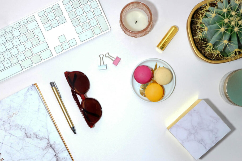
In workspaces, where productivity and focus are paramount, the effective use of color can significantly impact cognitive performance and overall well-being. A balance of stimulating and calming colors is key to maintaining productivity while also fostering a sense of calm and concentration. Incorporating shades of blue or green, known for their calming and focusing effects, can help reduce stress and promote mental clarity.
Meanwhile, pops of energizing colors like yellow or orange can inject a sense of vitality and creativity into the space, stimulating motivation and productivity. Additionally, incorporating natural elements such as wood accents or plant life can further enhance the workspace environment, promoting a sense of connection to nature and boosting overall well-being.
Ultimately, tailoring color choices to the function and purpose of each space ensures that the design not only looks aesthetically pleasing but also supports the activities and experiences that occur within it. By carefully considering the psychological effects of color and its impact on mood and behavior, designers can create environments that inspire, rejuvenate, and enhance the lives of those who inhabit them.
Incorporating Color into Design Elements
Color can be integrated into design elements in various ways, including wall paint, furniture, textiles, accessories, and artwork. Consider the impact of color on each element and how it contributes to the overall ambiance of the space. Bold accent walls can serve as focal points, while carefully curated accessories can add pops of color and personality to a room.
Experimenting and Personalizing
Don’t be afraid to experiment with color in your design projects. Start with small accents or accessories to test different color combinations and gauge their impact on the space.
Additionally, consider the preferences and personalities of the individuals who will inhabit the space when selecting colors, ensuring that the design reflects their tastes and enhances their well-being.
In conclusion, mastering the art of color in interior design involves a multifaceted understanding of color theory, psychology, and practical application. By delving into the intricacies of color relationships and harmonies, designers can create visually appealing interiors that resonate with emotion and purpose. Whether it’s crafting vibrant social spaces, serene relaxation areas, or productive work environments, the thoughtful use of color enhances the functionality and ambiance of each space.
By considering the psychological effects of color and tailoring choices to individual preferences, designers can create personalized and impactful environments that enrich the lives of those who inhabit them. As designers continue to experiment with color and push the boundaries of creativity, the possibilities for creating transformative spaces are endless.
So, embrace the power of color, experiment boldly, and let your designs come to life with vibrant hues and harmonious palettes.
